KAws Museum
Built a responsive site to help visitors browse exhibitions, buy tickets, and stay updated with clear navigation and engaging visuals.
Built a responsive site to help visitors browse exhibitions, buy tickets, and stay updated with clear navigation and engaging visuals.
Role
UX/UI Designer
Skills
Wireframing, Web Design, User research
Tools
Figma
Year - Timeline
2024, 3 weeks
Pictured above: a quick glance of the home page for Kaws Museum’s website
Background
A digital destination for fans of KAWS and contemporary art, this concept museum website was designed to make discovering exhibitions, exploring the artist’s work, and purchasing tickets effortless and immersive. I approached this project independently, taking on both UX and UI roles to simulate a real-world design process.
A digital destination for fans of KAWS and contemporary art, this concept museum website was designed to make discovering exhibitions, exploring the artist’s work, and purchasing tickets effortless and immersive. I approached this project independently, taking on both UX and UI roles to simulate a real-world design process.
The Main Challenge
How do you translate the presence of a physical gallery filled with oversized sculptures and pop culture energy into a digital experience that feels just as powerful and works smoothly for both casual visitors and dedicated fans?
The core challenge was finding the right balance between bold visual impact and clear usability. The goal was to ensure users could easily find what they needed, whether they were looking for museum information or purchasing tickets.
Process
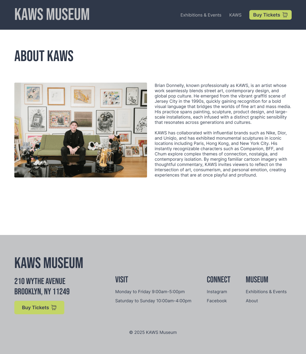
I started with inspiration from real museum websites like The Broad, MoMA, and the Brooklyn Museum, and pulled color cues directly from a vibrant KAWS gallery photo. After mapping out a clean site architecture, I created responsive designs for 7 key screens and applied a consistent visual system across desktop and mobile.
I started with inspiration from real museum websites like The Broad, MoMA, and the Brooklyn Museum, and pulled color cues directly from a vibrant KAWS gallery photo. After mapping out a clean site architecture, I created responsive designs for 7 key screens and applied a consistent visual system across desktop and mobile.
Colors
#2F3849
#C3D567
#C2C3C5
#F4F5F5
#025C91
Typography
Headings:
Bebas Neue
paragraphs:
Inter
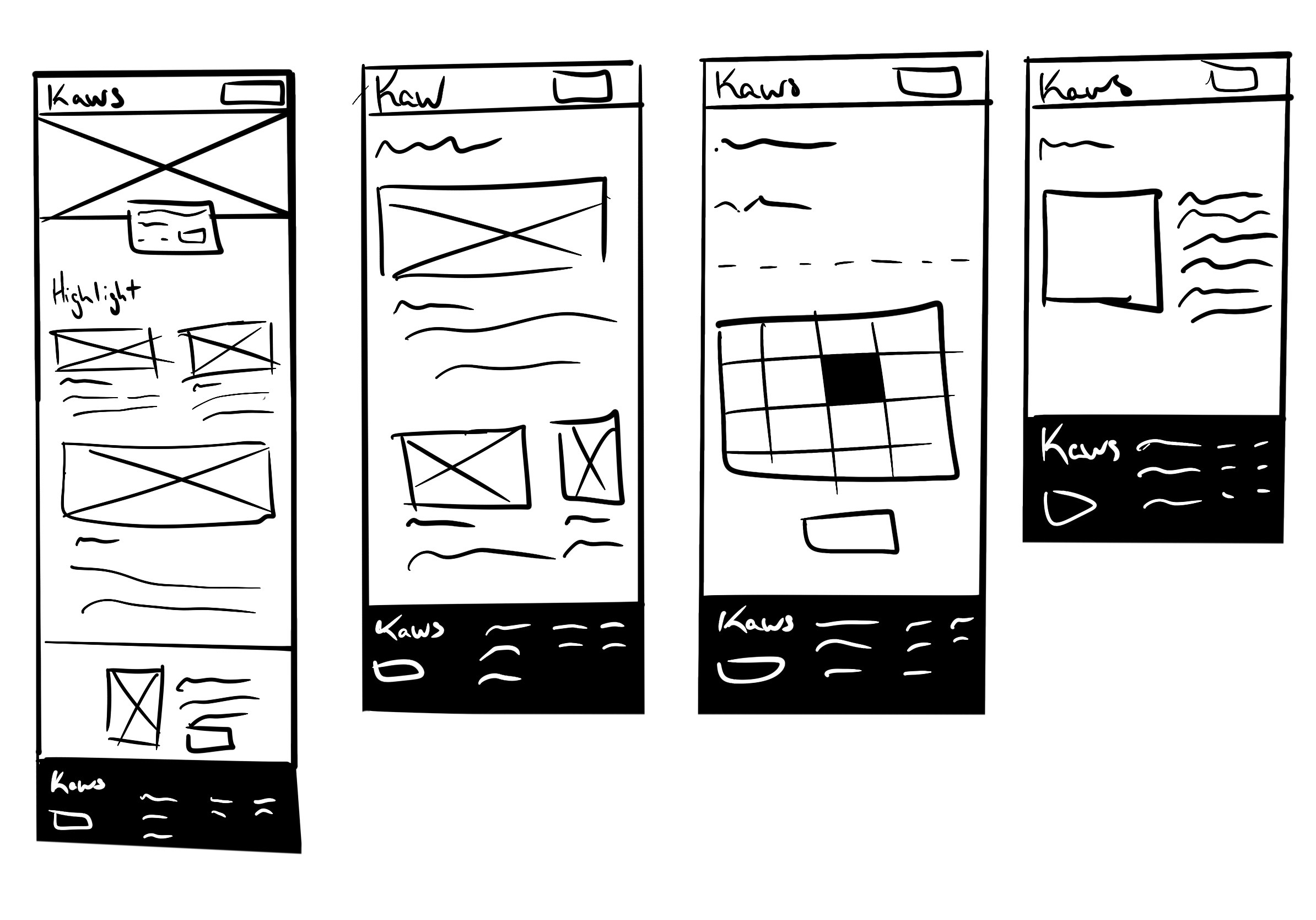
Initial Sketch
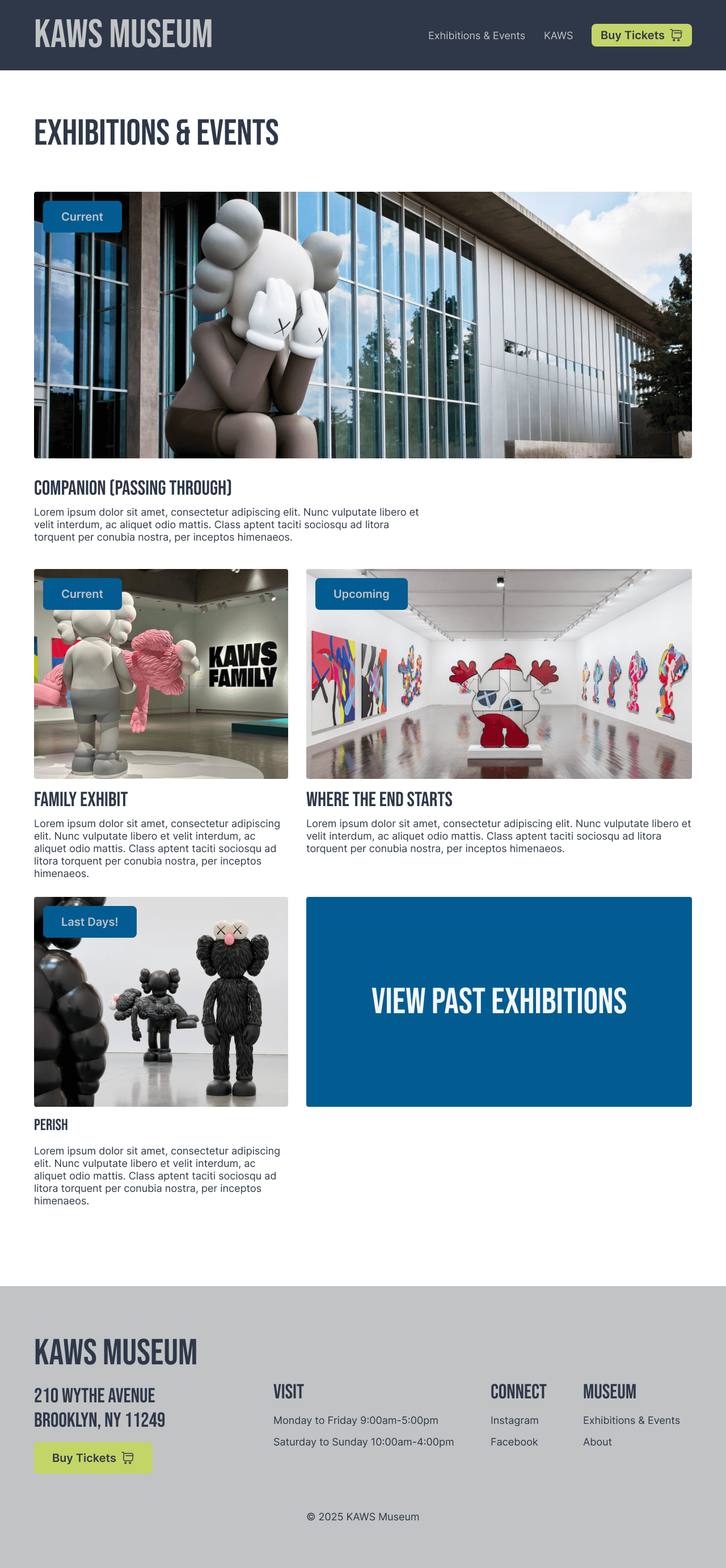
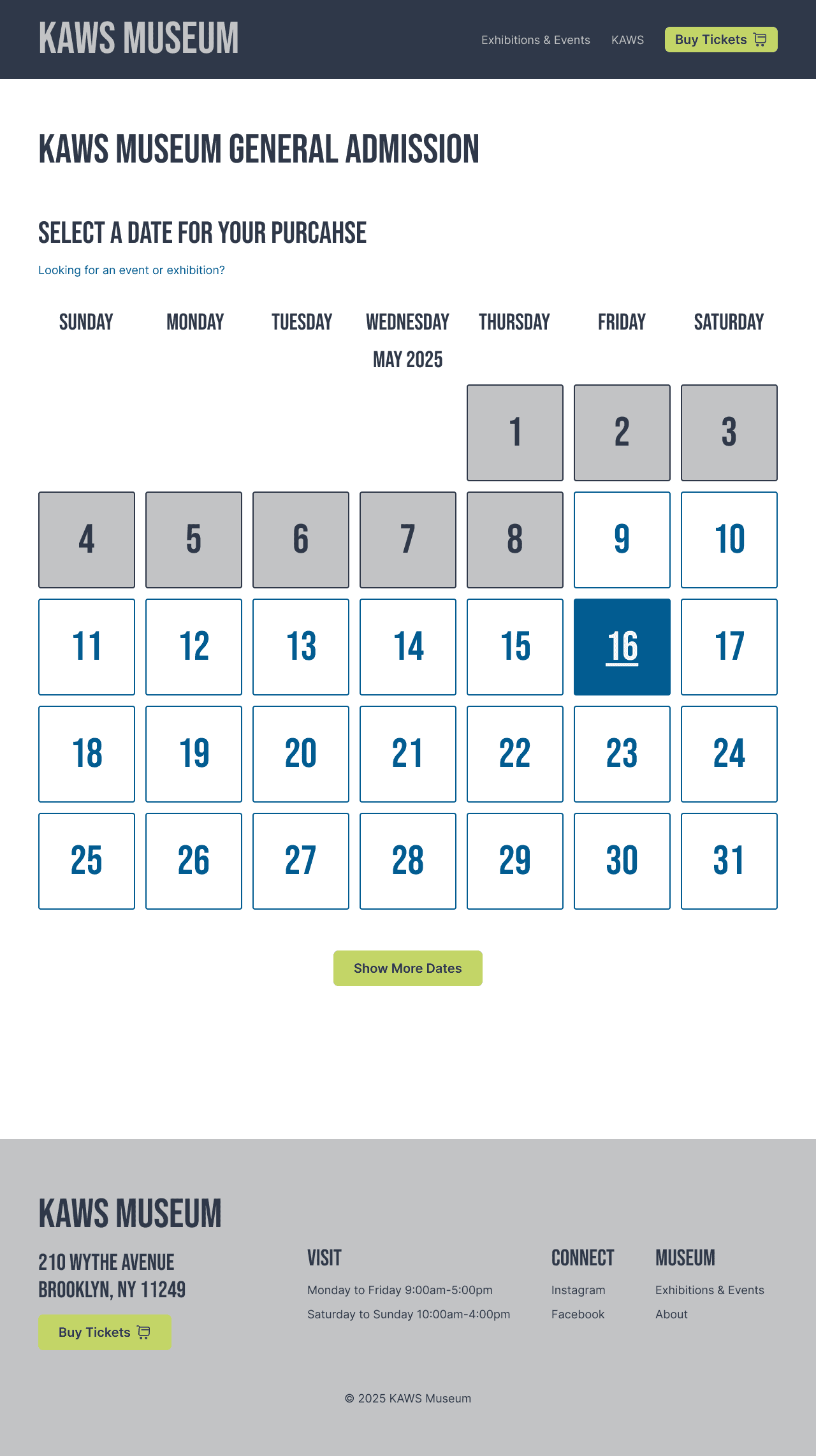
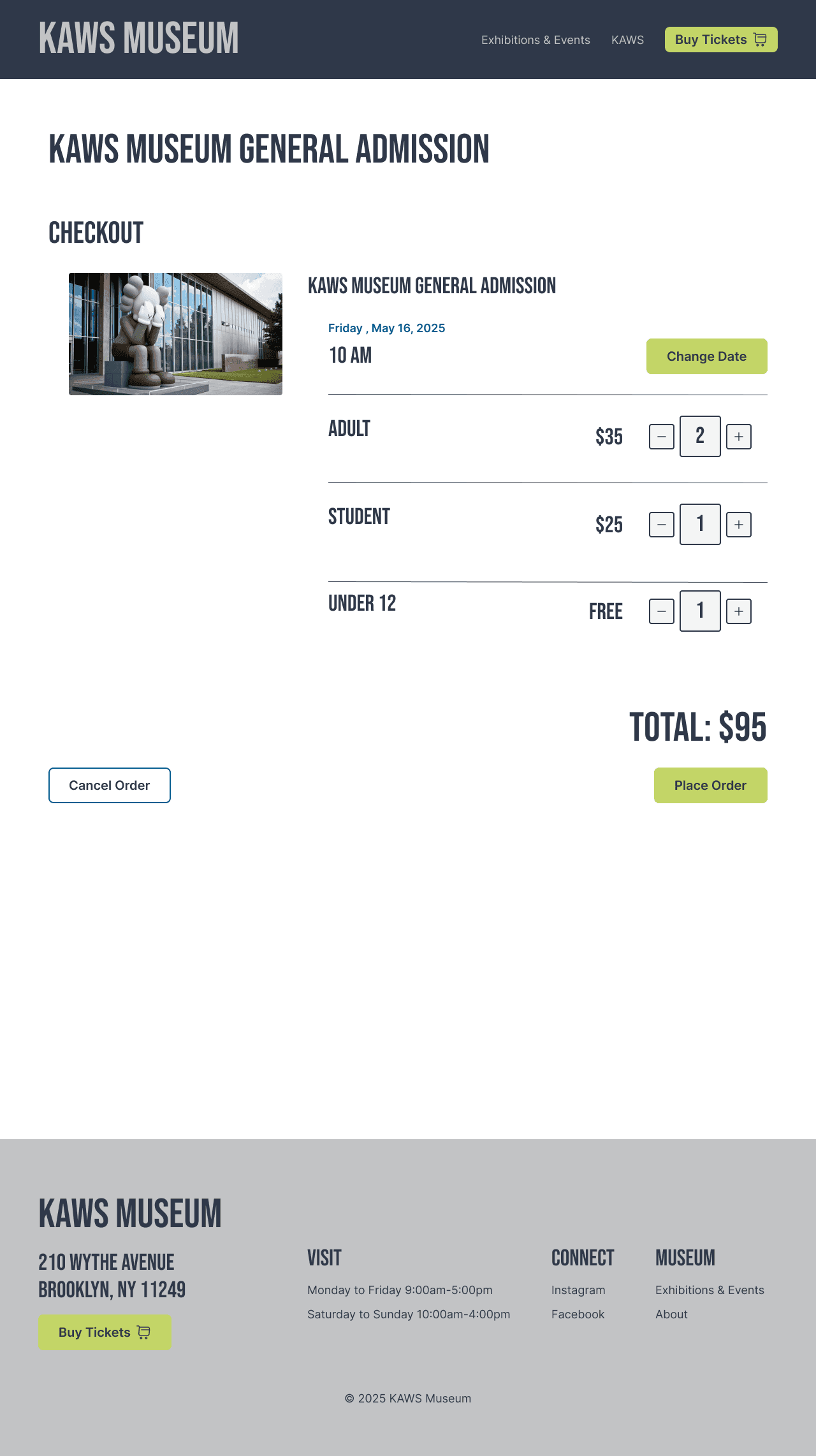
Pictured above: views of the final designs created for Kaws Museum’s website
(Left to Right: Home Page, Exhibitions & Events, Select Date, Checkout, Billing, Payment, About)
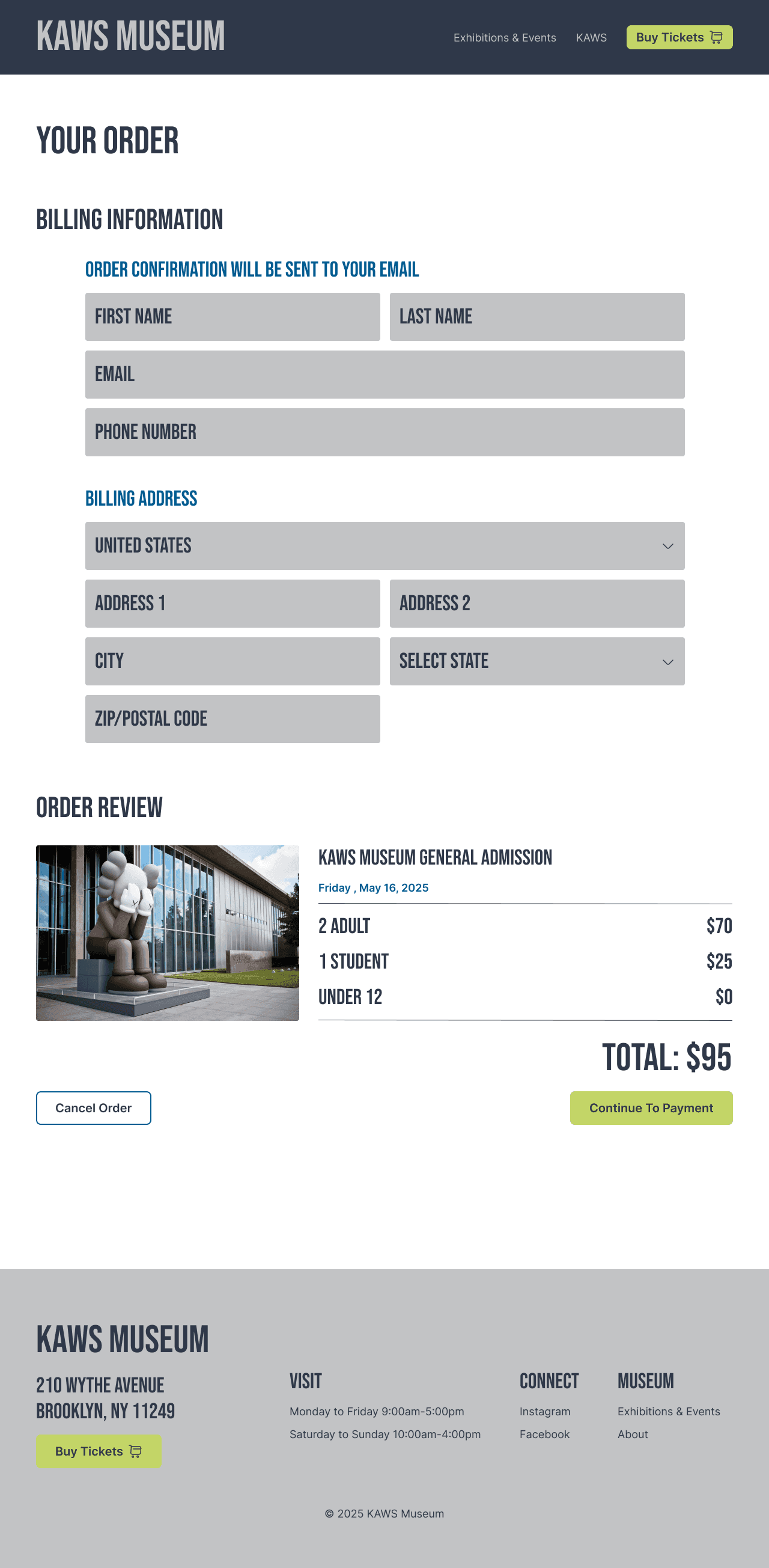
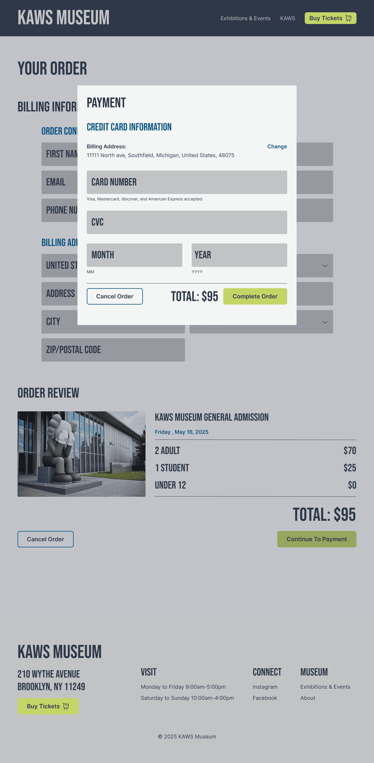
Solution & results
To create a digital experience that matched the boldness of the physical museum, I focused on clean layouts, large imagery, and intuitive navigation. The site was designed responsively for both desktop and mobile, with a clear path to essential actions like browsing exhibitions or purchasing tickets.
I introduced a simplified navigation system with a sticky header, making it easier for users to explore without feeling overwhelmed. Visual hierarchy was guided by bold type, thoughtful spacing, and a color palette pulled directly from the artwork. The ticketing flow was streamlined into four focused steps, reducing potential friction.
38%
Fewer Clicks to reach cheackout
65%
Increase in homepage scroll depth
95%
users completed ticket flow
Reflection
This project challenged me to think beyond aesthetics and focus more deeply on interaction flow and clarity. I am proud of how the ticketing experience came together because it feels both clean and efficient. If I had more time, I would expand the site with dedicated pages for each exhibition and include event booking to create a more complete experience.
This project challenged me to think beyond aesthetics and focus more deeply on interaction flow and clarity. I am proud of how the ticketing experience came together because it feels both clean and efficient. If I had more time, I would expand the site with dedicated pages for each exhibition and include event booking to create a more complete experience.