Reel Snacks
Role
UX/UI Designer
Skills
Tools
Figma
Year - Timeline
2024, 2 weeks

Pictured above: a quick glance of the home page and date selection page for ReelSnacks app
Background
ReelSnacks is a mobile app I designed to simplify the moviegoing experience. Instead of juggling multiple apps or standing in line for snacks, users can browse showtimes, buy tickets, and order food all in one place.
The Main Challenge
The biggest challenge was designing a preshow experience that felt fast and intuitive. I needed to make sure users could move from movie selection to snack checkout quickly and smoothly, without the process feeling overwhelming or cluttered.
Process
Colors
#021027
#FC7753
#011434
#F5F5F5
#49A9A7
Typography
Headings:
Space Grotesk
paragraphs:
Inter
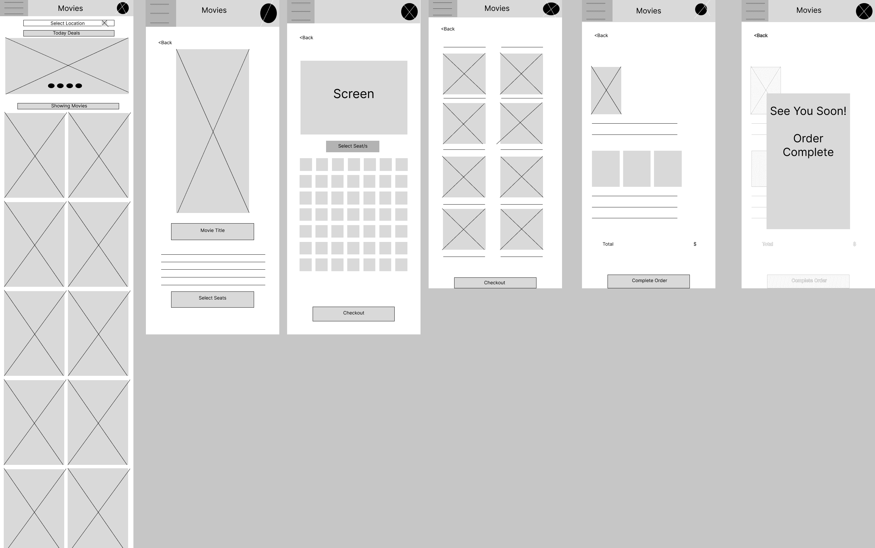
WireFrame
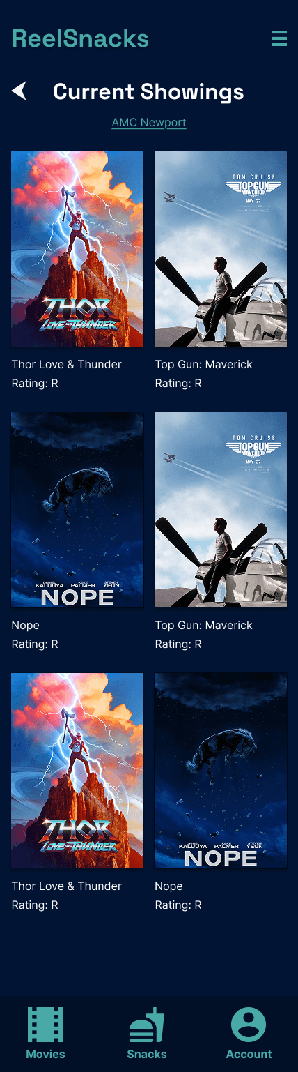
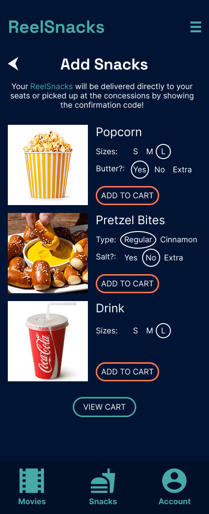
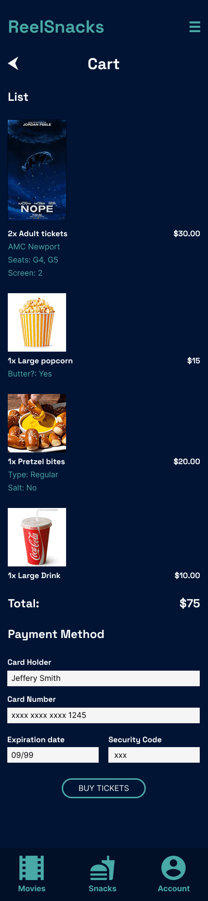
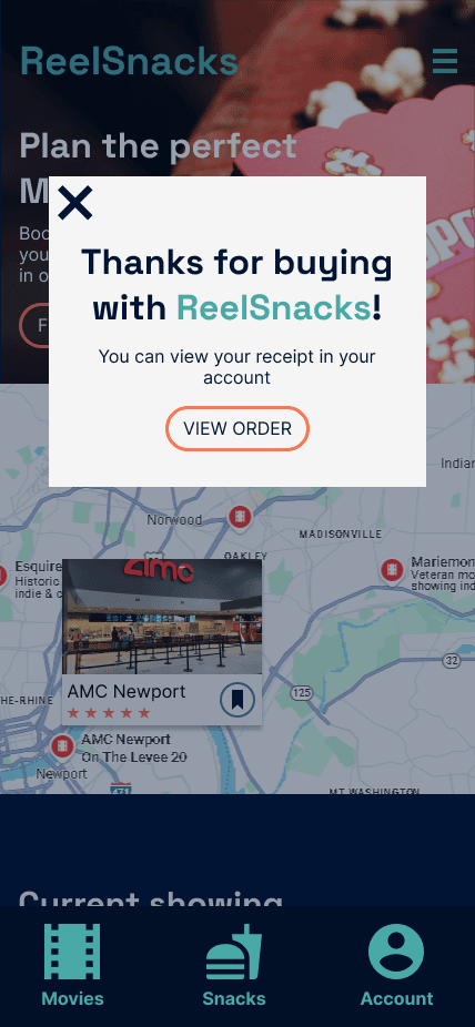
Pictured above: views of the final designs created for ReelSnacks app
(Left to Right: Home Page, Current Showings, Select Date, Time, and Seating, Add Snacks, Cart and Payment, Thank you)